Gas Pump Interface Design Flaws Reveal Deeper UX Lessons for Everyday Tech
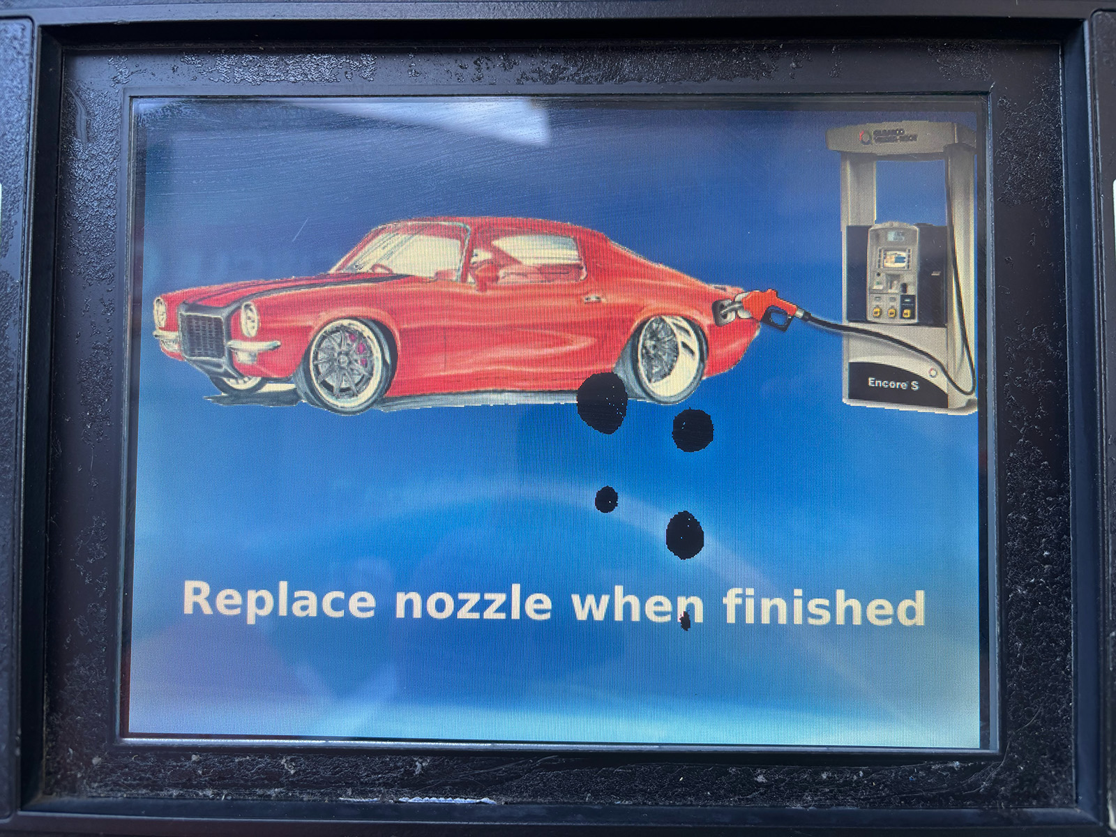
A recent road trip turned into an unexpected design critique for one driver, who found that the frustrating interfaces at gas pumps forced a reevaluation of long-held beliefs about user experience. The experience highlights how poorly designed everyday technology—like fuel dispensers with confusing buttons, unclear prompts, and sluggish touchscreens—can sour even the simplest tasks. The author notes that these design failures are not just annoyances; they reflect broader industry issues where cost-cutting and lack of user testing lead to products that fail at their core function. This matters because gas pumps are used by millions daily, and their clunky interfaces waste time, cause errors, and even pose safety risks if users are distracted. The piece suggests that the principles of good design—clarity, feedback, and simplicity—are too often ignored in utilitarian contexts, leaving consumers to struggle with machines that should be effortless. As vehicles evolve and fueling options expand, the need for intuitive public technology becomes more urgent. The takeaway: next time you're fumbling at the pump, remember it's not you—it's the design, and there's a better way.